Color Psychology in Branding
Color is a very powerful form of communication, and while favorite colors vary from person to person, each color has a degree of psychological and physiological response that is shared across people.
This makes color psychology in branding worth knowing for businesses that want to influence action from consumers. Research shows that people form an unconscious opinion about a brand in as little as 90 seconds, and more than 50% of that impression is based on color alone.
Of course, people don’t buy products based on color alone. A brand is more than color, but the top brands in the world choose their colors intentionally to use in their marketing and reinforce their brand identity. Color psychology can be used to:
- Trigger emotions and mood
- Inspire trustworthiness
- Differentiate from competitors
- Drive action and purchase decisions
In this article, we are going to explain color psychology in business and branding, and go over how different colors affect emotions so you can choose the best colors for your brand.
What Is Color Psychology in Branding?
Color psychology in branding is the study of how color influences human behavior, perception, and decision-making in the context of a brand. It is not a set of universal rules carved in stone. Different people react to colors differently depending on culture, personal experience, and context; however, there are patterns in which most people associate a certain color with a particular emotion. Knowing what these patterns are can help strengthen your brand.
Does Color Choice Really Affect How People Feel About a Brand?
Yes, color choice absolutely affects how people feel about a brand, but it is not the only factor. Feeling is shaped by context, including the experiences people have had with the brand and what they have heard from others.
For example, black is often associated with sadness. Yet it is the same color used by Apple, a brand that doesn’t signal sadness at all. On paper, black may signal something negative, but in practice it communicates sophistication, control, and premium quality when applied to Apple’s products and branding.
Brand perception is not driven by color alone. It is the result of how a company chooses to position itself and the direction it builds over time. Someone may associate a color with one emotion, then feel something completely different once that color is paired with messaging, design, and experience.
Color still plays a role, but it needs to be intentional. Decide what you want people to feel about your brand first, then use color, messaging, and design together to get more customers.

Brand Color Psychology Is All About Contrast
Choosing colors for your brand to evoke certain emotional responses from people is less about finding the perfect combination of colors, and more about building contrast between them. Combination and contrast are two different things. Contrast uses different colors to complement each other, while combination mixes the different colors together.
Contrast is strategic, while combination is rushed. Brand colors that are used in a strategic way elicit a more intentional psychological response from consumers.
If you browse websites built with AI-generated color palettes, you will notice a specific aesthetic. Multiple colors of similar saturation and warmth blended together in a way that looks retro. This is because AI will default to combining different colors, not contrasting them. Contrast is a fundamentally human quality. It requires judgment about tension, about what to push forward and what to hold back.

The Psychology of Colors in Business and Branding
The psychology of colors in business and branding is worth paying attention to. Red and yellow are the top colors generally associated with two of the deepest human emotions: love and joy respectively. The stronger the emotion, the more people agree on the color that represents it. The more subtle the emotion, the less people are likely to associate the same emotion with that color. For example, 68% of people associate red with love, while only 38% of people associate blue with relief. Love is a strong emotion while relief is the absence of a strong emotion—a calmness. This reveals a critical insight about the psychology of colors in branding and business. The stronger the emotion you want to evoke, the more predictable and scalable your color choice becomes. The more subtle the emotion, the less reliable color alone is in shaping perception.
A 2020 study published in the journal i-Perception surveyed 4,598 people across 30 countries, asking them to match colors with emotions. The results revealed that certain colors carry far stronger emotional consensus than others, and the pattern is not random. The deeper the emotion, the more people agree on the color that represents it.
Source: Jonauskaite, D., Parraga, C. A., Quiblier, M., & Mohr, C. (2020). Feeling Blue or Seeing Red? Similar Patterns of Emotion Associations With Colour Patches and Colour Terms. i-Perception. Study of 4,598 participants across 30 countries.
What is Your Favorite Color?
Choose your favorite color below to see how many others relate to your color preference.
689 people have voted
How Different Colors Influence Psychology and Behavior in Marketing
The use of color in marketing and business triggers both emotional and physiological responses that shape how people perceive a brand, make purchasing decisions, and form lasting associations. While the influence of color on behavior is not immutable, consistent psychological patterns do exist. This is why certain colors appear more frequently across specific industries and certain brands.
| Color | Psychological effect | Common in | Brand examples |
|---|---|---|---|
| Red | Energy, urgency, appetite, excitement | Fast food, sales, entertainment | McDonald’s, Coca-Cola, Netflix |
| Blue | Trust, calm, reliability, professionalism | Tech, finance, healthcare | PayPal, Facebook, IBM, Visa |
| Green | Health, nature, growth, contentment | Wellness, organic, sustainability | Starbucks, Whole Foods, Spotify |
| Yellow | Optimism, attention, warmth, friendliness | Food, retail, children’s brands | McDonald’s, IKEA, Snapchat |
| Orange | Creativity, excitement, approachability | Entertainment, value brands, tech | Nickelodeon, Fanta, Home Depot |
| Black | Sophistication, authority, luxury, power | Fashion, luxury, premium goods | Chanel, Nike, Gucci |
| White | Simplicity, clarity, cleanliness, purity | Tech, healthcare, minimalist brands | Apple, Tesla, healthcare brands |
| Purple | Imagination, luxury, creativity, royalty | Beauty, premium products, creative | Cadbury, Hallmark, Twitch |
| Pink | Love, warmth, playfulness, compassion | Beauty, fashion, lifestyle | T-Mobile, Barbie, Victoria’s Secret |
| Brown | Earthiness, stability, warmth, craft | Food, outdoor, artisan brands | UPS, Hershey’s, M&M’s |
| Gold | Prestige, success, wealth, quality | Luxury, finance, premium tiers | Rolex, Versace, Lindt |
How Red Affects Consumer Behavior

Red is one of the most emotionally intense colors visible to the human eye. Using red in branding creates emotional friction that leads to action. It captures attention and drives action through urgency, and even danger, and has been shown to increase heart rate and stimulate the senses. It is likely the only visible color that yields a positive result by bordering on a negative emotion.
In most contexts, red is associated with danger, warnings, and mistakes, and has even been shown to impair performance in tasks that require focus and thought. However, in consumer environments, performance isn’t the goal; fast decision-making is.
This is why clearance tags, limited-time offers, and “buy now” buttons are often red. The color creates a subtle pressure. It signals that something needs to happen now, and this tension, even though it’s slightly negative, leads to a positive business outcome: faster decisions and more conversions.
Why So Many Brands Use Blue
Blue in branding is widely regarded as one of the most calming and stable colors. It is consistently used by companies that want to communicate trust, dependability, and professionalism. This is why blue dominates industries like finance, technology, and corporate services, where credibility and security are critical to customer decision-making.
Beyond brand strategy, there is a broader psychological reason for its popularity. Blue is the most liked color globally, a pattern supported by large-scale surveys such as those conducted by YouGov. A commonly cited explanation is its natural association with the sky and water, both of which evoke calmness, openness, and stability.
However, the appeal of blue may go deeper than simple environmental associations. Unlike more emotionally charged colors, blue sits near the psychological midpoint of the color spectrum. Colors like red tend to trigger high-arousal emotions such as excitement and urgency, while darker tones like black are often linked to heavier or more negative emotional states. Blue, by contrast, represents emotional equilibrium. It is not stimulating or overwhelming. Instead, it signals balance, control, and predictability.
This neutrality may be exactly why it resonates so broadly. Using blue in branding does not demand a reaction. It creates comfort. In a world where many colors push people toward emotional extremes, blue offers stability, and that stability is universally appealing.
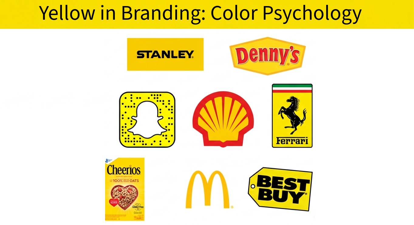
Why Yellow Grabs Attention in Branding
Yellow grabs attention because it is the most visible color in daylight; moreover, many associate the color yellow with joy, optimism, and energy. But overuse of bright yellow in branding can feel cheap or overwhelming, so the best application of yellow in branding is alongside another color or accent, especially black or red, which is common among brands.
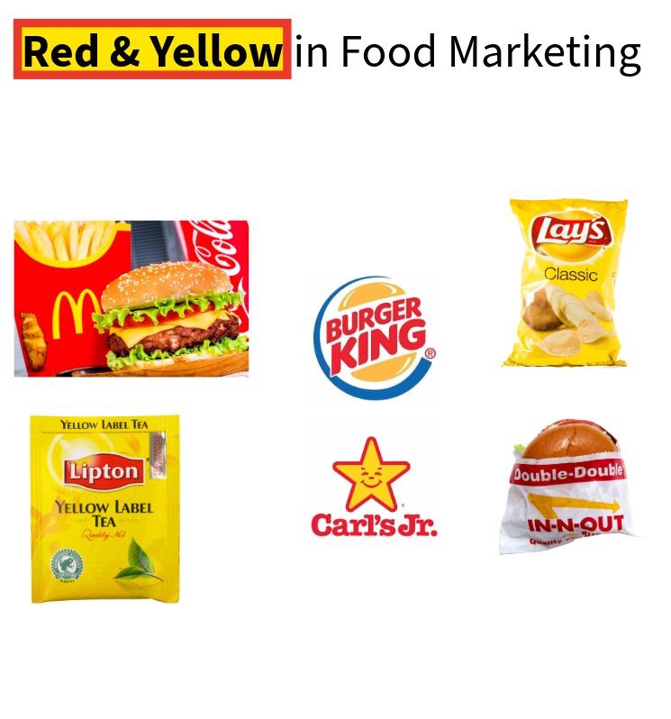
Color Psychology in Food Marketing
Red and yellow is the most common color combination in food marketing and branding. Red grabs attention and creates a sense of urgency, while yellow signals optimism and is highly visible in daylight. Together, the combination makes customers feel energized, welcomed, and ready to act, which is why it dominates fast food.
There’s a common misconception that red increases appetite, but that’s not entirely accurate. Research suggests red can actually suppress appetite in certain contexts. Its real role in food branding is to create urgency and drive quick decisions, not to stimulate hunger.
This is because people have a mental model of how food should look. When a food’s color deviates from that expectation, it creates friction. A chocolate chip cookie that’s tinted red feels off, the same way a blue steak feels unnatural. That mismatch reduces appetite, regardless of whether the color is red, blue, or anything else.
How Green Branding Represents Nature and Growth
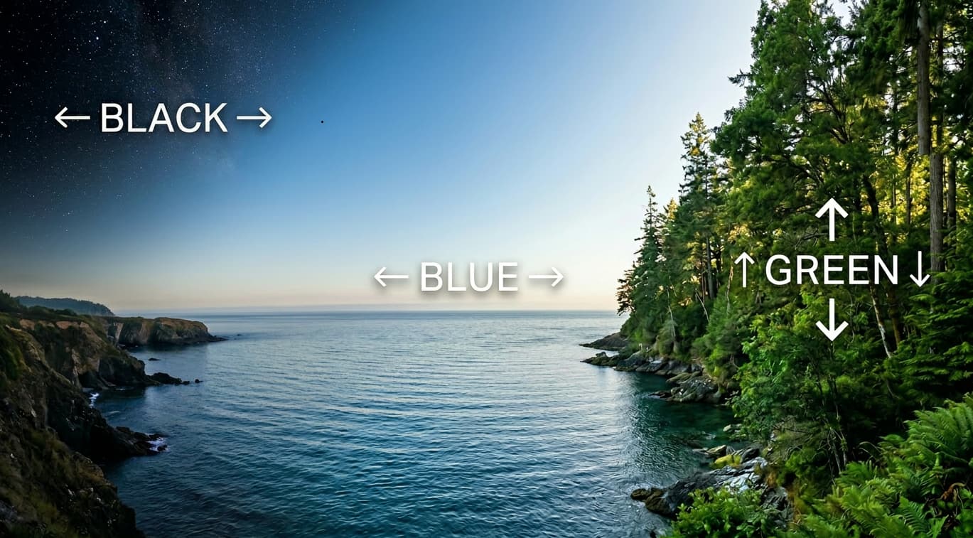
Green branding is associated with nature and growth because it’s the only color we strongly associate with things that are alive and actively growing. Trees, plants, and grass are all green, and they grow upward. That creates a deep, almost instinctive link between green and progress, nature, and growth.
If you look at other foundational colors, they don’t carry the same direction or behavior of green in nature. Blue, like water, moves horizontally in rivers, and when you stare into the ocean, you are likely to feel calmness rather than growth. Moreover, black, like space, covers everything, and when you stare into the night sky, you are likely to feel silence rather than growth.
However, because of its association with trees, green represents movement in a vertical sense, like growing upward. This is also why green is strongly tied to sustainability and eco-friendliness. It represents living systems, renewal, and balance with nature. But the meaning goes beyond literal nature. Brands can use green even if they have nothing to do with the environment and still tap into that perception of growth and forward momentum. Spotify is an example.
At its core, using green in branding signals nature and growth, and it works well because it aligns with how we already understand the earth. It reflects something we’ve seen our entire lives: green things growing upwards.
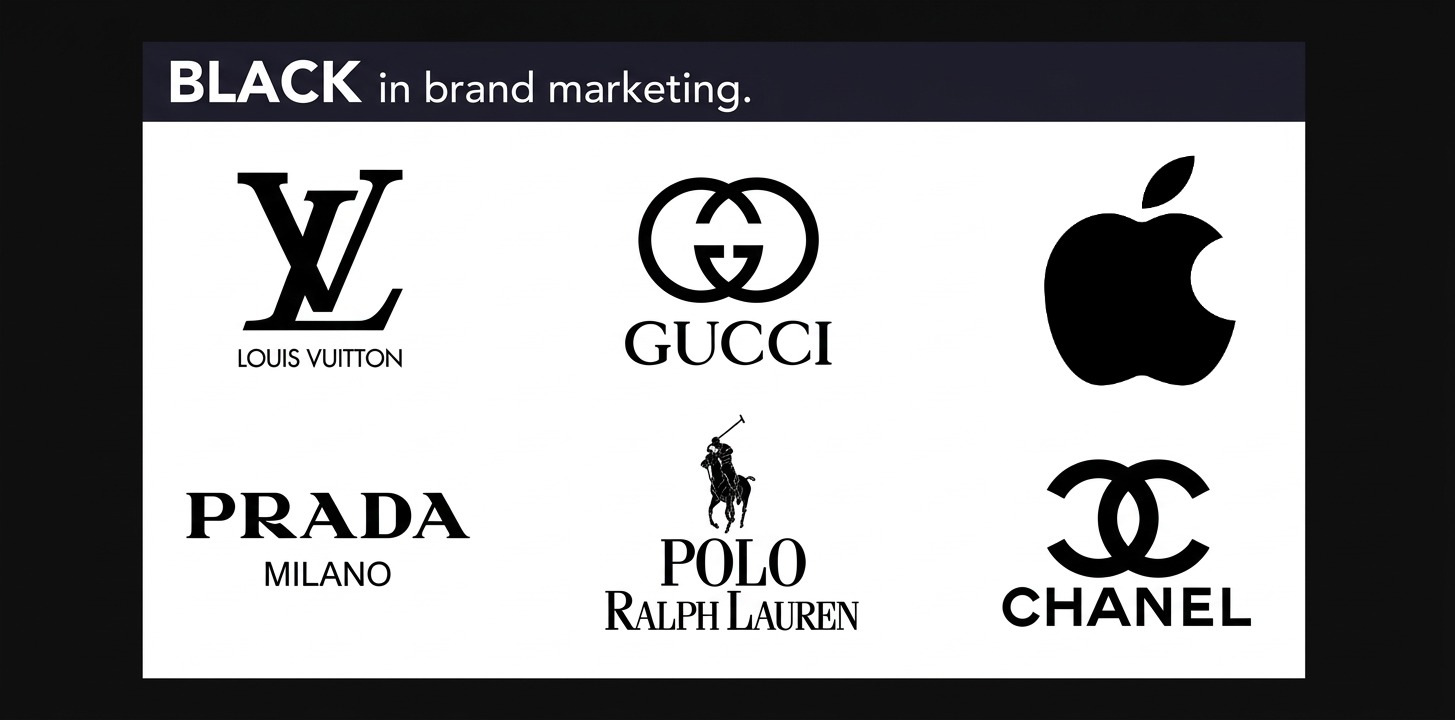
White and Black in Branding
White is the absence of black, and black is the absence of all color. White is blank space, and black is the color of space itself. Remove every element in the universe that produces color, including white, and what remains is black. In branding, black and white go together and convey power, confidence, and sophistication.
There are two main reasons why white and black is used in branding:
- It stands on its own. It makes the statement that the quality and reputation of the business speak for itself, and there’s no need for color to draw attention.
- It enhances other colors. Since black is the absence of all color, any shape or color paired with it pops. This makes black highly versatile, which is why many clothing brands favor it. Their logos can appear on almost any garment regardless of color.
Black and white branding is not just for fashion. In 1989, Apple shifted from its rainbow logo to a monochromatic black version to make the brand feel more sophisticated and adaptable. Since then, the black logo has complemented Apple’s sleek product designs and modern marketing. Considering iPhones carry with them a hefty price, it is clear why black is often chosen for high-quality products with strong reputations. The product and name itself is enough to sell.
Why Purple Stands Out as a Brand Color
Purple has the lowest emotional consensus which makes it one of the more polarizing colors in branding. Historically, it is associated with royalty and luxury, but now, many associate purple with creativity and innovation. Twitch uses purple to stand apart from the sea of blue tech brands. Cadbury has owned purple in confectionery for decades. It works best when a brand wants to feel distinct, artistic, or premium without defaulting to black.
What Orange Signals in Marketing
In marketing, orange carries the urgency of red and the optimism of yellow, but instead of competing for attention the way red and yellow do individually, it occupies a space that feels warmer, more approachable, and less aggressive. It is energetic without being urgent, and it is cheerful without being overwhelming.
A 2024 study published in the International Journal of Psychology found that orange backgrounds significantly sped up how quickly people recognized happiness-related words compared to blue backgrounds. The effect was replicated across two experiments with 448 participants. Orange does not just look happy. It primes the brain to process happiness faster.
Despite this, orange is one of the most overlooked colors in branding. The reason is simple: red and yellow individually capture more attention. Red is the most emotionally intense color on the spectrum. Yellow is the most visible color in daylight. In a world where every brand is competing for attention, those two tend to win. Orange gets passed over not because it is weak, but because it sits next to two of the loudest colors in existence.
Orange works when a brand wants to signal energy, creativity, and approachability without fighting for space in the red and blue categories where most competitors already live.
Which Colors Should You Choose For Your Brand?
If you are trying to decide which colors to use for your brand, start by deciding which one or two qualities you want your brand to express. If you want to signal growth, go with green. For trust, blue. For attention and urgency, red. There is no universally correct answer. The right color is the one that aligns with what you want people to feel, and that holds up consistently across your marketing.
Keep in mind that color is only one part of the equation. The effectiveness of a brand depends on context, and that context spans from the colors and messaging you choose, all the way to the post-purchase experience people have with your product or service. A strong color choice will not save a weak brand, but it will reinforce a strong one.
If you are building a brand from scratch or rethinking your current direction, the team at InspiringClicks can help. We work with businesses to develop brand identities that are strong, differentiated, and stand out in a crowded marketplace. Learn more about our branding agency.